
Men's Skincare Product Photography: 2026 Guide
Men's skincare product photography is beauty product photography adapted for a buyer who reads matte black, brushed steel, and stripped-back type as credible rather than a buyer drawn to soft glass and floral styling. The lighting, backdrops, and prop choices that sell a rosewater serum will undersell a charcoal cleanser or a matte-finish moisturizer built for a men's grooming line.
TL;DR
Men's skincare product photography favors matte charcoal, concrete, and steel backdrops over floral or pastel sets.
Courtney Dailey Photography treats grooming SKUs as functional objects, so weight, texture, and matte finish read before scent or story.
Amazon and DTC listings need a true white background with the product filling most of the frame; campaign shots can go moodier.
Skip pastel props and soft-focus glamour lighting on grooming SKUs; they signal a mismatch to a male-skewing buyer.
Why product photography matters for men's skincare brands
Men's grooming packaging tends toward minimal typography, matte tubes, and utilitarian caps rather than the ornate glass and metallic foil common in women's prestige skincare. That design language changes what the camera needs to prove: not luxury, but function, ingredient performance, and a masculine visual code the shopper trusts within a second of scrolling.
A men's grooming brand shooting the same soft, romantic lighting used for a women's serum campaign will produce images that photograph correctly but sell wrong. The cap looks glossy when it should look matte. The backdrop reads spa instead of gym bag. Buyers scroll past before reading the ingredient list.
This matters more in 2026 than it did five years ago, because men's skincare has moved off drugstore shelves and onto Amazon, Shopify, and Instagram Shop — channels where the product photo, not the shelf, is the entire pitch.
Step 1: Audit your current shots for gender coding
Before booking anything new, pull every current product photo and sort it by what it's silently telling the shopper.
Backdrop color: pastel, blush, and cream read feminine by default in beauty photography
Prop choice: florals, ribbon, and soft fabric versus leather, concrete, or brushed metal
Lighting quality: diffused and glowing versus directional and contrasty
Model or hand-model styling, if used, and whether it matches the brand's actual buyer
Typography and packaging visibility — is the matte finish rendering as matte, or glossy?
Step 2: Choose backdrops and props that read masculine without cliché
The safest palette for men's skincare product photography sits in charcoal, slate, warm wood, and unfinished concrete — not because men only respond to gray, but because these tones don't fight a matte black or brushed-aluminum cap the way a bright pastel does.
Charcoal or matte gray sweep for hero shots
Raw concrete or stone slab for texture-forward flat lays
Warm walnut or oak for grooming lines that lean barbershop-heritage
Brushed steel or aluminum surfaces for tech-forward or clinical positioning
Avoid soft pink, lavender, or floral props unless the brand is intentionally playing against category convention
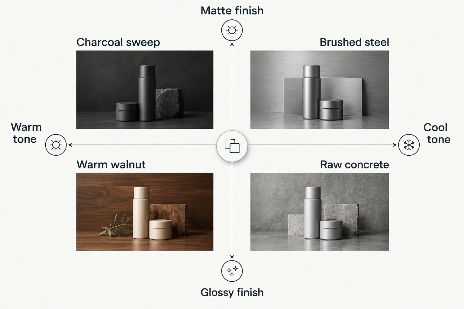
Charcoal and brushed steel carry matte packaging without competing with it.
Step 3: Light bottles and jars to show weight and matte finish
Matte packaging is unforgiving under the wrong light. Hard, undiffused light bounces off matte surfaces as harsh hot spots; overly soft light flattens the surface until it looks plastic.
Use a large diffused key light to control matte reflection without killing texture
Add a subtle rim light along one edge to show the bottle's actual weight and dimension
Keep fill light low-contrast so the cap doesn't read glossy when the product is matte
Shoot a straight-on hero angle, a 45-degree angle, and a tight detail shot of the cap or pump mechanism
Check every frame at full size — matte-to-glossy drift is the single most common lighting error on grooming SKUs
Step 4: Style grooming tools and packaging together
Men's skincare rarely sells as a single bottle in isolation — razors, beard oil droppers, and grooming tools often ship or market together. Styling them as a coherent set, rather than a cluttered flat lay, does more selling than any single hero shot.
Group by function (shave, moisturize, treat) rather than by size
Leave visible negative space so the set doesn't read as clutter
Angle tools to show their working end, not just the packaging
Repeat one consistent surface and light setup across every SKU in the line
Photograph textures — balm, clay, gel — separately from the packaging shots
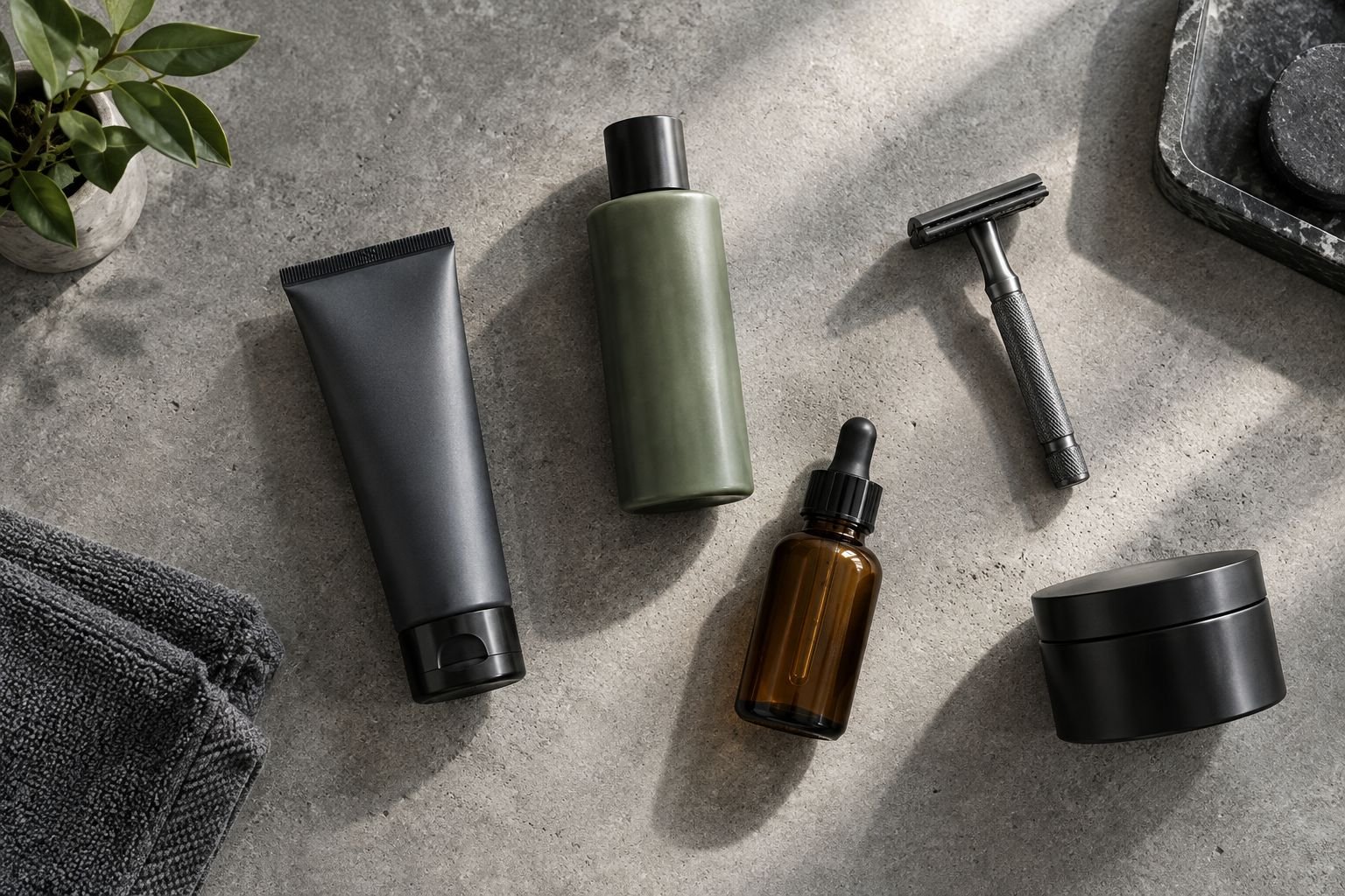
Grouping by function reads clearer than grouping by bottle size.
Step 5: Shoot for e-commerce and marketplace specs first
Amazon and most marketplaces require a pure white background for the main listing image with the product filling most of the frame — that's a platform requirement, not a stylistic choice, and it should be locked before any moody campaign shot gets planned.
True white background, no gradient or shadow bleed, for the primary listing frame
Product filling the majority of the frame with clean edges for cropping
A square 1:1 crop that works across marketplace and Instagram grid placement
A secondary lifestyle or texture frame for the listing gallery, shot separately from the white-background hero
Consistent crop and framing across every SKU so the storefront reads as one line, not scattered products
Step 6: Brief the photographer with a clear shot list
A vague brief produces safe, generic beauty photography that ignores what makes a men's line different. A specific brief — backdrop tones, finish notes, angle count per SKU, and which images are e-commerce versus campaign — gets the difference on camera the first time.
List every SKU with its exact finish (matte, satin, glossy) so lighting gets planned per product
Specify backdrop and prop restrictions upfront, not as a reshoot note
Separate the e-commerce shot list from the campaign or social shot list
Include competitor references only to name what to avoid, not to copy
Confirm usage rights and channels (paid social, print, packaging) before the shoot day, not after
Courtney Dailey Photography works from this kind of brief directly, which is faster and cheaper than reshooting after a soft-focus, pastel-toned set misses the brand.
Step 7: Build one consistent set across the full line
A single strong hero shot doesn't fix a storefront where every other SKU looks shot on a different day. Lock one lighting setup, one backdrop family, and one crop standard, then apply it across the entire line so new SKUs slot in without a full reshoot.
One lighting rig, documented, reused for every SKU in the line
One backdrop family (2-3 approved tones) rather than a new surface per shoot
One angle count standard — front, 45-degree, detail — applied to every product
A shared reference file so future shoots match without guesswork
Comparison: options for shooting men's skincare product photography
DIY smartphone shoot
Best for: Testing SKU layout before a formal shoot
Key limitation: Inconsistent color accuracy and poor control over matte-vs-glossy rendering
Freelance generalist product photographer
Best for: A single hero shot for a launch page
Key limitation: May lack grooming-specific control over matte finish and brushed metal reflections
Beauty and grooming specialist (Courtney Dailey Photography)
Best for: Full-line campaigns needing consistent matte rendering across e-commerce, social, and print
Key limitation: Requires a clear brief and lead time to book
In-house team with a basic lighting kit
Best for: Weekly social content on a tight turnaround
Key limitation: Staff time pulled from other work; quality varies shot to shot
Common mistakes men's skincare brands make
Reusing a general beauty backdrop kit. Blush and floral sets built for a women's line get pointed at a men's SKU without any audit, and the mismatch shows immediately.
Overlighting matte packaging. Hard key lights push a matte cap into a glossy highlight, which reads cheap and inconsistent with the ingredient positioning.
Treating grooming tools as flat-lay clutter. Razors and droppers scattered for visual texture instead of grouped by function confuse rather than sell.
Skipping texture shots on balms and clays. Men's skincare buyers respond to seeing product texture before they read the ingredient panel — a bottle shot alone leaves that unanswered.
Using one photo set across every channel. The white-background Amazon hero and the moody Instagram campaign shot are different jobs; forcing one image to do both underperforms on both.
Plan your men's skincare shoot
Get a shot list built around matte finish, backdrop tone, and channel specs.
FAQ
What's the best background color for men's skincare product photography?
Charcoal, slate, warm wood, and raw concrete read masculine without cliché in 2026 grooming campaigns. Pastel and floral backdrops built for women's skincare lines tend to work against a matte black or brushed-metal men's SKU.
Is men's skincare photography different from women's skincare photography?
Yes — men's skincare packaging leans matte, minimal, and utilitarian, so lighting and props need to reinforce function and texture rather than romance or glow. The camera techniques overlap, but the styling decisions diverge.
How much lead time does a men's skincare product photoshoot need?
Lead time depends on SKU count and how many channels the images need to cover, from a single hero shot to a full e-commerce and campaign set. A clear brief with finish notes and a shot list per SKU shortens the timeline the most.
Do men's grooming brands need texture shots?
Yes — balms, clays, and gels benefit from a dedicated texture shot separate from the packaging shot, since buyers want to see consistency and finish before committing. This is especially true for brands competing on ingredient claims.
What's the best photography style for men's skincare packaging?
Directional, moderately diffused lighting on charcoal or concrete backdrops that preserves matte finish without flattening the bottle's dimension is the standard approach in 2026 for grooming SKUs. Hard, glossy lighting tends to misrepresent matte packaging.
Should men's skincare brands use the same photos for Amazon and Instagram?
No — Amazon and most marketplaces require a pure white background with the product filling most of the frame, while Instagram and campaign placements benefit from moodier, styled backdrops. Shooting both in one session with two distinct setups is more efficient than a single crossover shot.
How many product angles does a men's skincare bottle need?
A straight-on hero angle, a 45-degree angle, and a tight detail shot of the cap or pump mechanism cover most e-commerce and campaign needs. Additional texture or in-use shots get added based on the channel.
Is DIY photography good enough for a men's skincare Kickstarter launch?
DIY smartphone shots work for testing layout and early concept validation, but inconsistent color accuracy and poor matte-vs-glossy control tend to undercut a crowdfunding page's credibility. A single specialist-shot hero image often outperforms a full set of inconsistent DIY photos.
One last thing
The fastest tell that a men's skincare photo set is wrong: check whether the matte cap looks matte at full zoom. If it reads glossy, the lighting rig — not the backdrop, not the props — is the problem, and no amount of backdrop swapping will fix it.